About the author
M. Ali Saatchi
Helping Game Studios Mastering Production, Monetization, and Leadership 🎮

Journal 45 M. Ali Saatchi November 20

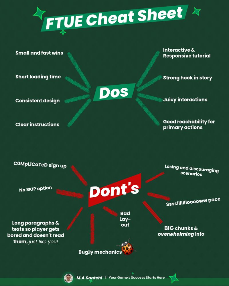
Follow FTUE Cheat Sheet to make sure you don’t churn your players.
If you have a good FTUE doesn’t necessarily mean you’re ganna be successful.
❌ BAD FTUE ABSOLUTELY RUIN YOUR MOBILE GAME
✅ Dos
❶ Small and quick wins
When a player installs your game, he’s entering a new world. It’s unknown. So make sure your guide him with small and quick wins and gradually progress.
❷ Short loading time
No one wants to wait so long just to see what your game looks like. If there’s sth important going on in the background, make sure you’re informing your player about it.
❸ Consistent Design
You must follow a same design language across your universe. Think of it as you’re placing driving signs here and there. If you consistently change your language eventually it leads to a chaos.
❹ Clear Instruction
As mentioned above, player enters into an unknown world, your game, and you need to make sure he has just enough guidance to go through the challenges
❺ Interactive & Responsive Tutorial
Following the previous point, when you want sth from your player and he does it or does sth else, make sure you response accordingly in each scenario
❻ Strong hook in story
A Strong in a game, keeps churning players away!
within the first 10-15 seconds of your game, make sure you present sth that attracts player’s attention and make them curious.
❼ Juicy Interactions
There’s a world distance between a juicy VFX when an interaction happens like performing a special attack VS just a simple hit with no exciting SFXs
❽ Good Reachability
Make sure your action buttons are in the reachable areas of player’s fingertips. So they don’t have to stretch far to reach them
❌ Don’ts
❶ Complicated Sign Up
Don’t confuse your player with long forms to fill out. Provide Sign up as a guest and later down the road ask them to register
❷ No Skip Option
If you have a long tutorial, make sure you have some options for player to make it quick or in some special occasions a Skip option (usually works for classic games i.e. Card or board games etc).
❸ Long Texts
No body wants to read long paragraphs!
Make sure you have some visual elements to communicate.
❹ Buggy Mechanic
There’s nothing more frustrating than a buggy gameplay! Always make sure your FTUE is smooth and debugged
❺ Losing scenarios
It’s better to avoid having losing conditions in your FTUE and make it in such a way that player would a winner in all cases (unless it’s a part of your story)
No disappointments in FTUE!
❻ Slow pace
Make things fast and quick, but not in such a way that they would be hard to understand. Moreover, make sure you animations are quick and not like a snail pace!
❼ Big Chunks of info
If there’s a big an overwhelming info that you need to communicate to player, you have to break it down into smaller rewarding steps
Last but not least
❽ Bad Layout
Make sure you have a good layout for your HUDs and UI elements.
#MobileGame #GameDevelopment
About the author
Helping Game Studios Mastering Production, Monetization, and Leadership 🎮
Please login or subscribe to continue.
No account? Register | Lost password
✖✖
Are you sure you want to cancel your subscription? You will lose your Premium access and stored playlists.
✖